Timeline For Pages Is Terrible
Today, Facebook announced Timeline for Pages. All pages will be forced into the new format on March 30th. For pages used as a support forum or for collaboration, the new design is terrible. A step backwards, rather than a step forward.
Not every Page is a “brand” that wants to promote an image with a nice big cover photo, or push their message to their users. Some pages, like the Social Fixer Page, are a support forum where users share feedback and ideas. My goal is efficiency and a sense of community, not a brand image. Timeline fails miserably for me.
I’m not just another user who hates change. I welcome re-designs and improvements. I’m not afraid of new features, and I like to push forward. In fact, the whole point of Social Fixer is to take Facebook to the next level and add even more functionality and features. But this change, IMO, is just bad in a number of ways.
What’s Wrong With It?
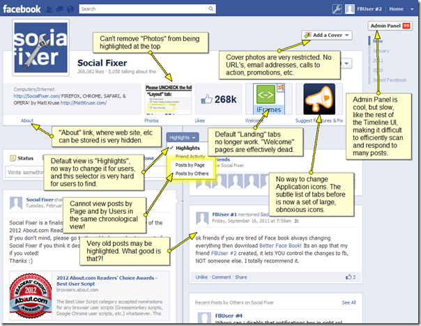
Here are my initial complaints (click to enlarge):
1) I cannot remove “Photos” from being highlighted at the top of the page. Previously, I could remove photos from being featured in the “photo strip”, and make the strip disappear entirely.
2) Cover photo content is very restricted, according to their FAQ entry. I can’t even put my web site in my cover photo? Really?!
3) Admin panel and Timeline in general are slow. I am all about efficiency, and being able to respond to many user posts as quickly as possible. Timeline bogs me down.
4) The “About” link, which holds helpful information that Facebook has banned from the cover photo, is very hidden.
5) Default “landing” tabs no longer work. Many pages had welcome pages which introduced the page to new users. All the time, money, and effort put into these pages is now wasted.
6) “Tabs” in the old pages were a column of text links on the left with very small icons. Now they are feature prominently at the top with large icons, and only a few of them are visible by default. This really hampers navigation.
7) The default view of pages is “Highlights” which is a filtered view of what FACEBOOK thinks is important for my users to see. The dropdown to change this very is hidden and many users may not find it at all.
8 ) I can either view Posts by Page or Posts by Others, but not both! I can no longer see a single stream of all interactions on my page. Terrible.
9) Facebook highlights interactions from my friends which may be very old. Even on my own page that I manage! What good is this? Why must I see this every time I visit my page?
Conclusion
Unfortunately, we’re stuck with what Facebook gives us. It seems to me that they want to define what Facebook is and how it is used, even if a large number of users actually use it differently. To them, everything is about branding and image and looking “awesome”. But many of us just want clear, easy to use, efficient functionality. We’re not all marketers trying to push a brand.
I’m very disappointed by Timeline for Pages.
Luckily, I write a little tool called Social Fixer. ![]()
As of this writing, about 300,000 people use it every day because – like me – they want to take back control of their Facebook experience. I will be working hard to add functionality and remove annoyances, hopefully before the forced roll-out on March 30th. Facebook never stops providing opportunity for me to improve on what they’ve built! ![]()
